HOME | DD
 VulnePro — Theos environments 08

Published: 2009-01-08 07:00:47 +0000 UTC; Views: 9525; Favourites: 257; Downloads: 347
Redirect to original
Description
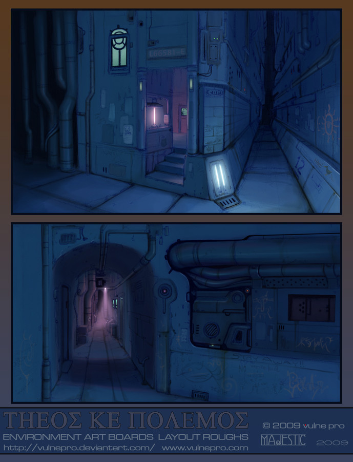
Here's another Theos Ke Polemos environment rough, initially riffed out in only blue colored pencil. Once again a locale on the planet Polemos (images of Indus will appear in the future). More a suburb on the outskirts of a city. The stuff on the road is, indeed, drawing by children of Indus and Anemos (Endiel Koh's second FOIL).I wanted to do more limited palettes like I did for the roughs on environments 05 so here we go, cool blues. There will be more for sure.
Again this is a quick rough so I'll point out the perspective isn't spot on before anyone else does
 (Wink)") It's more or less just eyeballed free form sketch. Once more posted as a devation to alert folks this stuff actually ends up in scaps.
It's more or less just eyeballed free form sketch. Once more posted as a devation to alert folks this stuff actually ends up in scaps.I usually do these environment roughs really fast (often at the Laundromat crampt little tables). All that matters to me with this stuff is exploring the ideas quickly. Later I can go to some I find the most interesting and do refined, finished, and detailed image art. Ultimately these rough sketches are just fun to do, turn off the critical brain and let loose. When developing ideas more is always better (so long as you do the initial roughs quickly) as you can sort things out after the fact.
Colored Pencil with digital colors in Photoshop CS3.
Related content


Comments: 32


pretty awesome!
i love how you draw environment, espescially this one
i like the details, and also it's very nice how you did the gradation
bold at front, and soft at background
👍: 0 ⏩: 0

it's so really cool o3o i really find interesting that you wrote God and War in greek xD
👍: 0 ⏩: 1

My thanks  (Smile)")
👍: 0 ⏩: 1
Yea ok I was gonna ask why you didn't write it Kai xD;;;; (isgreekactuallysoyea) Lol, thanks for telling me xD
👍: 0 ⏩: 1

I love the grungy industrial feel. The pipes, wires, and the general shape of the buildings really characterizes the picture.
👍: 0 ⏩: 1
Thank you very much for the kind words, I appreciate it. Yeah, the vibe is indeed a mix of encroaching, oppressive industrialization mixed with a sense of old world artisan driven craftsmanship.
👍: 0 ⏩: 0

This one's a winner. Really good.
The perspective does not bug me, except perhaps the skyscrapers which really flatten out. That, and the lefthand grate on the ground which fights the vanishing point. The best bits are the lighting, which un-balances the composition and adds a lot of dynamism, and the design details on the buildings.
You sort of lose some of the light graffiti traces in the foreground. The open area in the foreground works better with subdued detail, maybe it would be best if it were left out completely.
Overall, awesome. I was initially struck by the dramatic lighting. It really carries the piece.
👍: 0 ⏩: 1
"The open area in the foreground works better with subdued detail, maybe it would be best if it were left out completely."
best if the detail were left out, I mean. As a clean graphic shape it works well.
👍: 0 ⏩: 1
My thanks Tom.
The perspective doesn't bother me much either but I wanted to note it anyway. As stated this stuff is rough pre-viz sketch work, done fast just to get the ideas out and move on. The graff was something I just added in there as much a visual reminder to me as to anyone viewing this. I plan to revisit that idea again in a more final piece. It's on it's own layer so I can pull it up, down, or off entirely.
Happy you dig it and thanks for the kind words. My intention wasn't anything more than jotting down ideas quickly so it's nice everyone seems to be digging this rough stuff so much.
👍: 0 ⏩: 1
There is something to the notion of presenting your roughs as finals. Sometimes they have a quality which gets lost once we clean them up.
There is a new Frazetta book out there which shows nothing but his rough sketches. I haven't seen it yet, but I've read a review and look forward to checking it out. One of the things which makes Frazetta's work so amazing is that he is well attuned to the special quality of rough drawing. From the book:
"At first we did roughs on everything and got them approved. Often the roughs were superior to the finished art. The roughs had more charm, more color, more everything. Then, finally, I gave up doing the roughs altogether. Frank would say, ‘The hell with roughing this thing, that’s doing it twice! You know I can do it. They’ll take the final painting and like it - the hell with the rough!’ And it worked."
Photoshop now gives us the ability to preserve that special quality of a rough drawing and make it presentable.
👍: 0 ⏩: 1
I have to totally concur. SO often a rough illustration has that special quality that, as you note, can get lost in translation. So ultimately there's the appeal for many in presenting those roughs. For me it's a bit of that but ultimately it's getting to the core idea as directly and quickly as I can.
Photoshop has certainly changed the way we can present and produce work. For some it can be a crutch or gimmick but for others it's an extremely effective and valuable tool for creating works. It's versatility is quite a wonderful thing to have access to.
👍: 0 ⏩: 0

It makes me wanna go stroll there
👍: 0 ⏩: 1
My thanks ")
👍: 0 ⏩: 0

I need to start designing levels because that would be a sic level
👍: 0 ⏩: 1
It's not intended for a game level but certainly could be one I suppose
👍: 0 ⏩: 1
No problem, I just love your work
👍: 0 ⏩: 1
Thanks man
👍: 0 ⏩: 0

Thank you
👍: 0 ⏩: 0


Sunny day, there are no FOILS to get in my way.
Can you tell me how to get to...
Looks like a scene from Yowl's Strolling castle.
👍: 0 ⏩: 1

Great feeling with this one, sorta like crisp morning air-ish if you know what I mean, looking at the thumbnail I though it was 3D, very very nice. I absolutely love those tiny details like "Indus sucks", i think it's the most "realistic" sci-fi city yet created, it really feels like it's populated, not like the usual steril giant cities were used to in most sci-fi. Loving it.
👍: 0 ⏩: 1
Thanks man, I appreciate it
👍: 0 ⏩: 0

Great atmosphere. The movie is already starting when I what it
👍: 0 ⏩: 1
Cool beans. I'm glad these rough layouts are evoking that. More final and detailed works will be coming in the future as well. The rough ones are good to get ideas out fast though so I will be doing a lot of these.
Right now, a quick freelance gig so more of this soon enough
Thanks!
👍: 0 ⏩: 0

impressive work for a laundromat scribble. C:
👍: 0 ⏩: 1
My thanks, appreciated
👍: 0 ⏩: 0