HOME | DD
 VulnePro — Theos environments 03

Published: 2008-10-30 22:20:41 +0000 UTC; Views: 2455; Favourites: 45; Downloads: 140
Redirect to original
Description
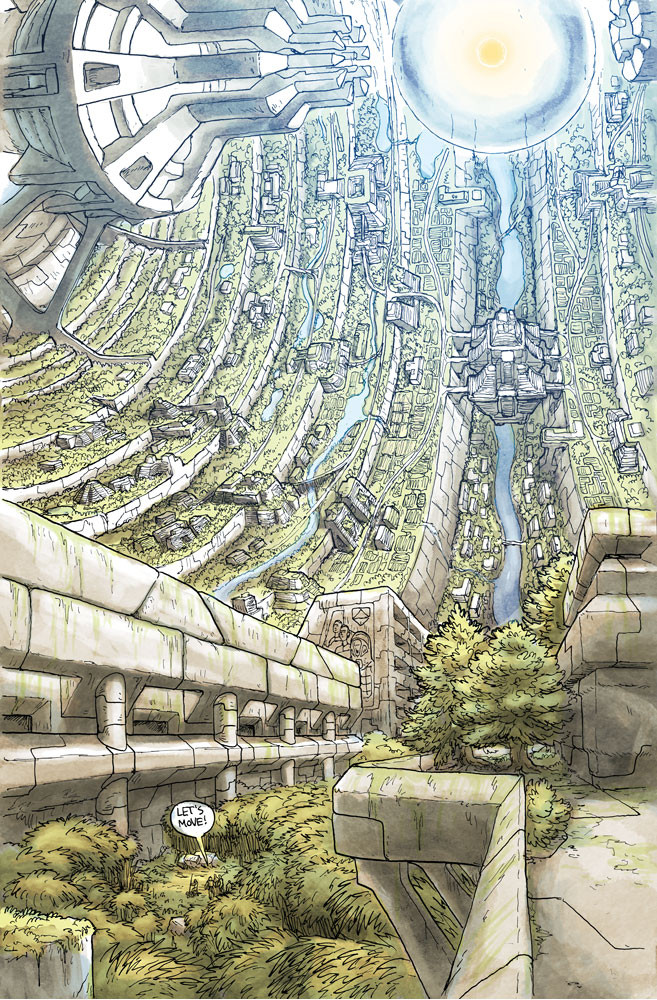
As promised there are to be more of these quick art board roughs. After experimenting with some various approached I've pretty much settled on this look overall for those to follow though I certainly won't be dogmatic about that. So again we have rough colored pencil illustrations with a low opacity digital wash of color.Both shots are Polemos garrison settlements. We have one in a forested location and the other out in the desert. Again the ever present specter or war and industry breaking up the quaint picturesque locale and setting.
Colored pencil, Photoshop CS3
Related content


Comments: 17

i'd love to see the finished product of all this work.. keep it coming
👍: 0 ⏩: 1

Thanks man  (Smile)")
👍: 0 ⏩: 0

These colors seem awfully washed-out. They are a world away from some of your other work which has the full gamut of value from black to full-saturation color and bright white. You totally lose the sunset in that lower one. Sunset = transmitted light = full saturation.
Make it pop: photoshop adjustment layer (levels), auto level that sucker, then paint in your cast shadows on the buildings and foliage using a mask on that adjustment layer.
👍: 0 ⏩: 1
Howdy Tom, indeed you are right the color is desaturated but that was actually intentional and I do note it in the posting. It's actually a low opacity wash color layer that gives it a more quick watercolor vibe so I specifically worked with a more low saturation range in mind. Although it's very true this isn't the level of my normal color work it wasn't supposed to be, they're just meant to be really fast snapshot layout pieces.
I don't know if the Disney guys do these kind of pieces for early pre-viz but actually it's very common of many of the Japanese studios early rough pre-pro work. Miyazaki is a great example of this. All his quick and rough scene studies are super low saturated watercolor work and even rougher than these. They all look fantastic and get the idea across quickly. It seems the various studios employ any number of techniques and media for these quick roughs and none of them are the super polished stuff.
Kenichi Yoshida's (animator from Studio Bones) works are also a fantastic example as his layout stuff employs varied media from piece to piece even on the same project: [link] All just super quick early pre-vis work. [link]
I like doing these cause they're just fast and to the point. You can bet I will be doing the full gamut works as well as I have no intention of abandoning that, they're way too much fun to work on those  (Wink)")
👍: 0 ⏩: 1
Your work is uniformly clean. Are you concerned that a casual viewer might not understand that this is a rough and would make a judgment based on the merits of the image as if it were a final?
👍: 0 ⏩: 1
Sorry for the late reply been tied up with Robotech stuff for Palladium Books.
I honestly can't say I'm too worried about that, as a serious concern, but sure I imagine that could happen, sure. Overall it's pretty clear in the posting and on the art itself it's a rough sketch. Also it seems the folks surfing this site are quite savvy about this kind of stuff. Most of the rough illos goes into scraps for that very anyway but seeing as how a lot of folks are now following this specific project I try to post some as Deviations to remind folks the rough stuff is there in the scraps.
I finally have some time to work on this stuff again so I will be doing a lot more and definitely plan to do more final painted works
👍: 0 ⏩: 0


Thank you! I'm glad that still comes across even with these light wash quick layouts
")
👍: 0 ⏩: 0

again
i am loving the building style and the desert scene
👍: 0 ⏩: 1

Very industrial, very appealing. Your love of decals/logos surely gives the city a unique look, the streets must be very narrow and cozy, more more.
👍: 0 ⏩: 1
Thanks a lot man
👍: 0 ⏩: 0
My thanks man
👍: 0 ⏩: 1

Hey man
Thats why I do um all the time.
The idea has gotta get out there lol.
👍: 0 ⏩: 0