HOME | DD
 GH-MoNGo —
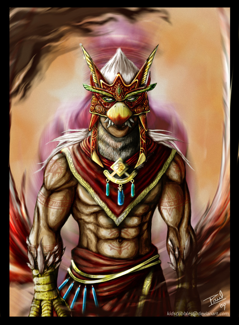
Tidebringer
GH-MoNGo —
Tidebringer

Published: 2010-02-22 00:56:47 +0000 UTC; Views: 9443; Favourites: 313; Downloads: 0
Redirect to original
Description
Finally finished! I tried a lot of new things for this one. For starters, most of the lines were inked in with a brush instead of a quill pen. It kept things smooth and really let the undertone of the colored inks show through. Also I tried to get over my fear of saturated cool colors, something my watercolor professor heckled me about for the better part of two semesters while I was taking his classes.I have fallen in love with Brown Ochre (PY43, sold as "Goethite Brown Ochre" by Daniel Smith). It's semi-opaque and glazes beautifully over just about anything with a soft wet brush over a dry layer of paint. I wonder why I didn't try using it in flesh tones before.
Watercolor, ink, casein on Twinrocker 200 lb. CP watercolor paper.
Related content


Comments: 182

Thanks man! I like the texture too. It's something you can only get with watercolors.
👍: 0 ⏩: 0

Your paintings are always so beautiful ;__;
👍: 0 ⏩: 1

I like that shade of blue and the water makes me all happy inside. Also Seagull/eagle (going for golden eagle) looks awesome! great work there.
👍: 0 ⏩: 1
Thanks!
I was trying for a sort of seagull look without having him look too white.
👍: 0 ⏩: 1

The end result looks good, well done! I really like how the waves came out (not that the bird man doesn't look good either of course 
👍: 0 ⏩: 1
Thank you!
Yeah, I like how the waves came out too.
👍: 0 ⏩: 0

Lookin' good man! The water is my favorite part  (Smile) - :)")

👍: 0 ⏩: 1
Thanks man!
Definitely! You don't have to wait for the beads of ink to dry on the paper.
👍: 0 ⏩: 1
yeah man, nothing worse than having spatter marks all over a piece. One of the reasons I got into using Gesso so much for details, helps for cleaning up areas.
It looks like you used something like gesso on his wings, Gouache, or am I dreaming?


👍: 0 ⏩: 1
Nope. The wings I just layered and wiped out over and over to get a really soft, clean look. Another good thing about doing lots of washes with semi-opaque pigments.
👍: 0 ⏩: 1
Nice man! You've definitely got a new style going on. It has evolved nicely over the last few years
👍: 0 ⏩: 0

I really like the pose and the angle. Gives him the larger than life feel of a god. I also like how you did the water. Moving water is always so damn hard to do. Great painting!
👍: 0 ⏩: 1
Thanks!
Yeah I took a page from the Japanese printmakers on the water. It has a much more graphic feel to it.
👍: 0 ⏩: 0

This is godly, the coloring came out great.

👍: 0 ⏩: 1

Very nice work!
Great pose and excellent coloring/painting!

👍: 0 ⏩: 1


It's strange see an air element on water element (eagle and the sea), It looks so interesting.
👍: 0 ⏩: 1
I tried to make him look more like a seagull.
👍: 0 ⏩: 1
Oh, really? I thought it was a eagle.
The colors and anatomy are great, good work.
👍: 0 ⏩: 0

Nice! I love the sense of scale, and the perspective used on the axe/halberd is flat out awesome.
👍: 0 ⏩: 1

Epic colors~ added by anything else I already said before~

👍: 0 ⏩: 1

Very cool concept. Love the angle and colours.
👍: 0 ⏩: 1

<= Prev |