HOME | DD
 hypergojira — Green Dragon - D4e

Published: 2009-01-13 17:34:56 +0000 UTC; Views: 11040; Favourites: 75; Downloads: 2293
Redirect to original
Description
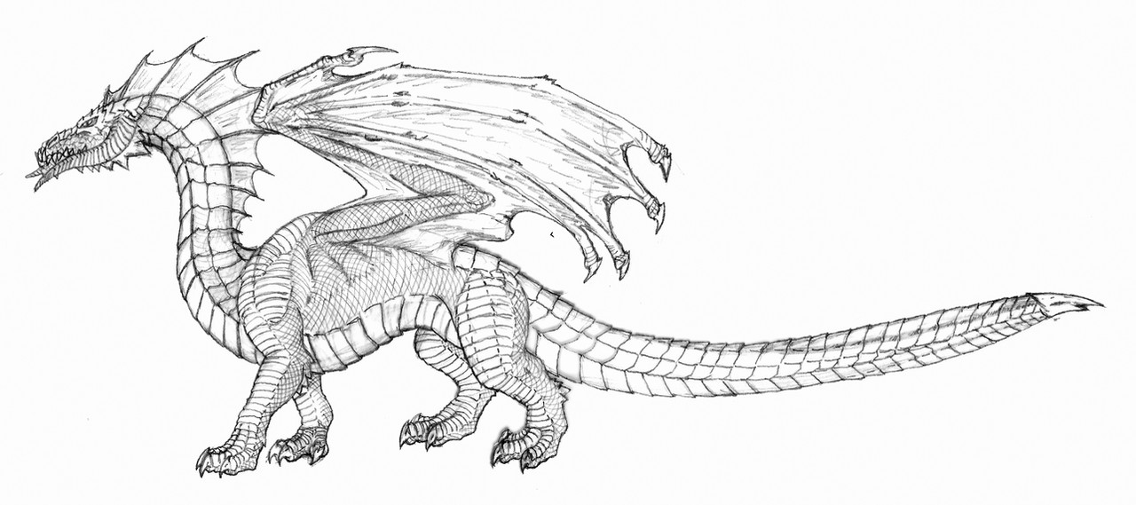
Here is my version of the Dungeon and Dragons D4e green dragon. The new D4e green dragon is a very iconic dragon with its long neck and tail and row of dorsal spikes. I decided to add to this by adding tail spikes for a very classic dragon tail club, spike, sting etc. I also added the horns on the hips. Otherwise it follows the D4e design pretty much. If you want to know why I am posting this dragon (and future ones) checkout my journal here: [link]P.S. There will eventually be a color version as well.
Related content


Comments: 74

I like your passion and interesting thoughts about Cyan. I'm still a little partial to the original 1e version of the green dragon, but I like this design better than the 2e & 3e version.
👍: 0 ⏩: 1

Thank you! I have always loved Dragons... even before it was really popular, Just like the drow! I always remembered the image of Lorac the elfking and Cyan talking into his ear.
You could make this into an entire campaign because people seem to for get one thing about that whole story... Lorac summoned Cyan, so most likely he knew what he was getting into.
👍: 0 ⏩: 1
Yep that storyline could definitely be developed more. I could see Cyan providing great boons are first to draw the elves in and slowly poison their minds into submission.
👍: 0 ⏩: 1
I could see them being bound to him in a similar way as drow to Lloth, and any physical changes(green hair tinted eyes etc...) they would attribute to their closeness to the green of the land...
👍: 0 ⏩: 0


Y'know, I certainly exaggerated the waist issue on this example (some critic). The trimmer abdomens & powerful limbs sported by D&D's menagerie are a refreshing departure from many older portrayals' stumpy-legged, mild to moderately obese midsections, but it's possible to take that change a bit far in the opposite direction. None of these designs are anywhere near the greyhound/whippet build range, so I'll shut up about the waists.
👍: 0 ⏩: 1
np whippets are a little freaky aren't they. They almost don't seem possible.
👍: 0 ⏩: 0
First off, some general positive traits I've noted from each of these interpretations:
-the wings...intricately arranged fingers/claw-tips, solid muscular bases, and general above-average proportions compared to the body (as fantasy critters go).
-the feet...again, finely taloned and (with one exception) each set seems capable of supporting the beasts' bulk.
-the scales/scutes...each race is intricately layered & endowed with a notably unique texture.
With all that in mind, I'll be trying to review these critters based on my personal preferences rather than how faithfully they conform to any official descriptions/illustrations. As such...Gregole might have a point about the horns. Since three of the five chromatics sport their own uniquely arranged/textured arrays of horns already, the somewhat blank, generic (though well-rendered) pointy bits tacked upon this Green seem a bit lacking by comparison (though I dig the dorsal/hip/club-spines. Go figure).
In other news, I like this design's oddly articulate-looking wing finger, and that neck looks muscular enough to support the skull fine. Combined with the erect, muscular legs & slightly uneven balance 'tween shoulders & hips, and the Green's build actually reminds me of prosauropods (sauropod predecessors) like Plateosaurus & Massospondylus. That wasp-waist kink in the midsection does put me off, and the dental array seems a touch small, but neither detail (nor, for that matter, the horns) truly ruins this version for me.
Hope this little rant was worth your wait.
👍: 0 ⏩: 1
thanks as always for your thoughts.
I'm not a big fan of the nasal, but I want to give it some time before I eliminate it. The horns around the 'cheeks' are supposed to stick out to the side some, but I didn't render that very well in propfile. I added the tail club - I just felt it need something.
Now come on, do you really think I don't know what a prosauropod is! I'm hurt! - just kidding
I clearly didn;t get across the waist of the drawing properly. It has the thickes waist of all of them bar far, but everyone seems to think it tiny. The back arches high actually makes the waist quite thick, but I admit that is mostly hidden by the wings. The green design is the one D&D chromatic dragon the doesn't have a feline like wiast line, but clearly I didn;t draw it properly.
The teeth are a bit small.
👍: 0 ⏩: 0

It's ok, I guess. I'm not a D & D fan, so my opinion is rather useless.
👍: 0 ⏩: 1
You may not be able to comment on how it compares to the official design, but you can always comment on the design or the art itself. Thank you for the fave.
👍: 0 ⏩: 1

It looks really good, but I don't like the nose horn, and the neck may be too...flimsy?
My problem with the nose horn is Greens have never had that before-why did they put that on? It sort of takes away from the Blues' iconic nose horn, in my opinion, of course. The neck isn't too bad, it just doesn't look thick enough to hold that strong looking head.
The rest of the desing is really good-I love the details and powerful looking body. The wings are shaped very nicely, and look big enough to hold him up. I do miss the back fins a bit, though the spines look good. The head is wonderful, despite the horn-it still looks like the Green I love.
All in all, a very nice design, just with some things that irk me personally. If you like it, though, I say keep it. It does still look awesome, really.
The only dragon designs I really, deeply loath are the new Gem Dragon designs. Ugh. DX
👍: 0 ⏩: 1
Well the design is not mine. It is the new D4e design, I only added the tail club/spikes. I don't like the nose horn either - I'm not sure why they added it.
I don't mind the skinny neck - it helps set it apart from the others and the green always had a long skinny neck.
👍: 0 ⏩: 1
I know. I was just expressing my dislike for it here. Sorry for that.
He did, at that! I just had a look at my 2nd Ed. book, and he really did have a long, snaky neck there. I retract my statement.

")
👍: 0 ⏩: 1
no problem, i think alot of people dislike it. I do think that overall it is an improvement over the D3 design though.
👍: 0 ⏩: 0

I don't know much about Dungeons and Dragons, and how this version does justice to another, but this is a pretty cool dragon design, although the neck looks a bit too long and bendy compared to the rest of the body.
👍: 0 ⏩: 1
It is not dragons are very often designed today, but it was very common not that long ago. I think this design is more of a homage to the older designs.
👍: 0 ⏩: 0

I like what's going on here. I've never been too sure if I preferred the streamline cat-like body of the 3rd edition dragons, or the chunkier lizard bodies of the prior engagements. It's hard to distinguish because of my hazardous love for kaiju and their lumpy posteriors. Still there is a powerful hunting presence to the newer dragons body style. I'm interested to see what you come up with.
👍: 0 ⏩: 1
thank you for the encouragement. However, i am really not going to change the individual dragon designs (from the D3 & D4 look)very much. I will just tweak them a very little bit. I really just want to get reference designs for my take on an updated Tiamat. I hope you like them.
Personally, I like both styles as well. Some of the Lockwood design are a little extreme, but they do jump!
👍: 0 ⏩: 1
I haven't gotten my hands on the 4th edition MM yet, so I haven't been able to check out the newest dragons. It's hard to find a balance between being dynamic and "extreme" enough to be cool looking, without sacrificing the believability and animal nature of the things. Good luck sir.
👍: 0 ⏩: 1
I've just looked through it at the book store, but [link] (Wizards of the Coast who own D&D) has a lot of galleries of their D&D art. In fact you can get most of the pictures from the Draconomicon (3rd & 4th editions), but I haven't looked to see if the MM is posted.
It is, I might give it a try some time!
👍: 0 ⏩: 1
I have the 3rd edition Draconomicon, and I think I should flip through once again and compare it to the ones in the new edition (which I've played successfully... once?)
👍: 0 ⏩: 1
Always a good idea. Skim of the 4e rules made me wish I still played.
👍: 0 ⏩: 0

Not bad looking, but when I saw it, I hated the new style they had for the green dragon. I mean we already had a dragon with a big front horn like that I really didn't think we needed another one.
👍: 0 ⏩: 1
Thanks. I generally like the design, but I agree about the horn. I'm not sure whay they did it. But that doesn't make me hate it. I really dislike the skeletal heads of the black and blue more (i've changed those in me redesign as well).
👍: 0 ⏩: 1
Well, I tend to just do my own thing with those anyways. But you know me, I love drawing the reds. They are fun. I love doing the frills.
Good drawing, though, just based off of a bad design in 4e. But that's my humble opinion.
👍: 0 ⏩: 1
Thanks. I'm really not trying to mess with the design much, just a few tweaks here and there. I am really just making these so I can have a refernce for my Tiamat design.
👍: 0 ⏩: 1
Well, I can't wait to see you do the big five-headed bitch. I need to do mine as well.
👍: 0 ⏩: 1
I'm really itching to get here done as well, but unfortunately she is the last one I will finish. Maybe I will post the sketch to get peoples thoughts.
I look forward to your take on the Queen of the Dragons!
👍: 0 ⏩: 3
Sorry, something went screwy with my computer. -_-
👍: 0 ⏩: 1
no problem, the same thing happend to me a few minutes ago.
👍: 0 ⏩: 0
Well, I did my sketch of her a while back, I just need to finish coloring her.
But I am looking forwards to it and I'd love to see your red dragon as well.
👍: 0 ⏩: 1
I have a sketch, but just with the red dragon head so far. I have a rough sketch of the red dragon as well. All of them are profiles becasue I am trying to scale them all properly (that and I'm not so good at perpective).
👍: 0 ⏩: 1
I know how that feels. I suck at perspective too. Which is why Jon's head doesn't look like it moves much.
👍: 0 ⏩: 1
Wahh! Misery loves company.
👍: 0 ⏩: 0
Well, I did my sketch of her a while back, I just need to finish coloring her.
But I am looking forwards to it and I'd love to see your red dragon as well.
👍: 0 ⏩: 0

Honestly, I don't like it.
Now, I was never a fan of the 3rd and 4th edition designs as they are, but at least the third edition version captured a few of the things the original design had going for it.
I may not like dragons now, but I remember back when I did. And I remember the green dragon being my favorite. There were a few simple elements that they at least translated into the new designs. The spiked elbows, triangular jaws and sail fin running from crown to tail were all key features which I don't see here. It never had horns, and never needed them. Some hornlettes around its jaw, brow and chin would suffice.
Also, though I'm probably the only one who thinks this, I just plain hate the build. It's the same build as the 3rd edition designs - which I also hated.
I liked dragons back when they didn't look like cats with long necks and scaly skin. But moreso, I liked the green dragon back when it looked like the green dragon.
👍: 0 ⏩: 1
Damn your fast! I really could not stand the D3 design - it was so top heavy and clumsy. Unfortunately I gave away my original Monster Manual (the 1977 version) about 10 years ago, but I still remember the original green pretty well. It was never my favorite, but I liked it better than the D3 version. I liked teh long neck and tail and the crocodile like head - all very classic dragon features.
I actually think the D4e version is more reflective of the original. It did get rid of the membrane between the dorsal spikes and added the nasal horn (which I don't care for myself), but the body is more like the orgiginal and less cat-like than the rest of the designs (though I do like the cat look). In most of the lockwood designs the shoulders are higher than the hips, but the D4e green is the opposite with higher hips. Also the back curves up, so the highest point is between the shoulder and the hip. Thus, I would call the build quite different than the other D3 or D4e designs. To me this is the largest thing that makes it better than the D3 version, but I also like that the snout is more crocodile-like, how I remember the original.
Actually, one of the things I don't like about the Lockwood designs is that many of the Chromatic dragons have such short necks (not compared to cats though). I changed this in several of my sketches.
I am sorry you don't like it, but thank you for the comments. It goes to figure that I would post a bastardized version of your favorite dragon first - just my luck!
👍: 0 ⏩: 1
The long necks are one of my biggest gripes, actually. I don't know where they came from. VERY few dragons of folklore had necks that were all that long. Most of them were no longer than those of any other predator - one of the reasons I used to like them. They felt stable and strong.
I could tolerate the cat build if the necks and heads weren't so uselessly long and puny.
I've never seen the 4th edition design, but if it has a horn and removes the sailfin, I have an instant dislike of it.
👍: 0 ⏩: 2
here are some more:
[link] and [link]
and look at the long neck of the lion on this one: [link]
this one is pretty good too: [link]
and the gruesome death of St. George's dragon (short neck version): [link]
👍: 0 ⏩: 2

In my opinion, those are dragons (and nice ones too.) Even if they were just gigantic snakes, they would still be qualified as dragons. In fact, dragons and snakes came from "wyrm" which helps describe their serpentine shape. In multiple cultures, myths of snakes, lizards, and crocodiles became dragons by visual imagination. And, there are serpent dragons, which are supposedly dragons with features of gigantic snakes; which still makes them dragons.
👍: 0 ⏩: 1
Well "Dragon" comes from the greek word "drakon" not "wyrm." Though the meanings are virtually the same as the greek "drakon" and the northern/scandenavian "wyrm" were both seprent like beasts. The have become synominous, but the origin of the word is greek.
👍: 0 ⏩: 1
In retrospect, some of them do indeed have feline body shapes - but STILL appear far more hideous and monstrous than the pirssified dragons that pollute modern fantasy.
👍: 0 ⏩: 1
I have the same issue with the modern stance on vampires. they were never intended to be GQ boys and girls - they are supposed to rip your throats out!
P.S. Did you ever see my take on Glaurung? [link] The color is wrong, is this more to your liking.
👍: 0 ⏩: 0
I've always appreciated both actually. i really like Jeff Easly's dragonlance dragons with their short powerful necks. But I appreciate the long slender look as well.
I don't know what folklore you are speaking of, but most that I have come across relly gave poor descriptions of what a dragon looked liked. This left it open to many interpretations, with historical artist taking differnt views on the subject matter. I think generally dragons were seen as something "different" so it made a lot of sense to give them longer necks to note this difference. Of course all asian dragons have long necks and the classic medieval/christian concept of a dragon often seemed to have long necks too:
(St. George's - [link] and [link] , this guy - [link] german - [link] greek - [link] and some english - [link] and [link] and this guy: [link]
So why do you say very few had long necks? I had a harder time of finding historical images of short necked ones. What tale(s) are you speaking of?
Yes the D4e version is pretty much what I posted, but I added the tail spikes. I could do without the horn myself, and they already have two chromatic dragons with sails, so I understand why they got rid of the sail - but I miss it as well. It never mad much since for a forest dragon, but it was always fun to draw.
I image that you like the proportions of Lockwood’s blue dragon then (short neck and all)? Personally I am really put of by the skeletal look of the blue and black dragon heads. I think they need more meat (I’m not a big fan of under bites as well).
P.S. I'm the idiot who has been trying to post this reply for a 1/2 hour because it keeps crashing when i try to preview it. i hop this gets to you.
👍: 0 ⏩: 1
First of all, the Asian dragon is not a dragon. It's its own creature which Western explorers decided to call "Asian Dragons" because they vaguely resemble the Western creature.
Secondly, most of those creatures do have relatively short necks. Even the ones that are fairly long are still shorter than the torso - which is more than can be said of fantasy dragons.
I suppose the neck length isn't what bothers me. It's the elegance everyone and their dog is trying to pull off.
Even the dragons that are designed to be loathsome and vile STILL look like effing horses with wings!
The dragon is not a creature of elegance. It never was. Even the most benevolent of dragons were always downright fugly. By its very definition, the dragon is one of the most vile, repugnant creatures of its time and region. It literally combined EVERYTHING those people hated. Even if you try to make it look like an animal and not a demon, it should still be ugly. It should be splayed out like a lizard, not holding itself majestically like a metrosexual brachiosaurus. It should have obvious snakelike qualities - the Europeans' hatred of snakes was more or less the entire basis of dragon mythology.
I'm all for taking "ugly" creatures and giving them ACTUAL personalities, but I am SICK of everyone trying to prissify their dragons. There was nothing like that in mythology - or the first two editions of D&D, for that matter, and no indication the Smaug - the very reason dragons are even included in D&D - was built as such.
I don't like the skeletal look either, and it is refreshing to find someoen who shares my view on that matter. However, that's hardly the only problem I have with modern fantasy dragons.
I have no problem with talking dragons. Many did talk in folklore. Granted, EVERYTHING talked in folklore, but talking dragons isn't that hard to believe. However, there was NEVER any indication that they were particularly wise, uber-powerful or the size of kaiju. I can recall precisely one kaiju-sized dragon in a book of dragonic fairy tales I once checked out. And it turned out to be a robot.................. That was a weird story, come to think of it.
Now there are a few diety-like creatures with dragonic forms, but even those are subject to interpretation - Jormugaunder was more of a snake, in my eyes and Typhon as a dragon doesn't come anywhere CLOSE to the badassery of the chimeric monster that shot lava from its eyes that he was portrayed as in some circles.
Where was I going with this again? Ohyeah, I hate the horse look!
👍: 0 ⏩: 1
| Next =>