HOME | DD
 NotMatthias — Minnesota Wild Concept
Published: 2011-07-28 05:06:11 +0000 UTC; Views: 1588; Favourites: 6; Downloads: 2
Redirect to original
Description
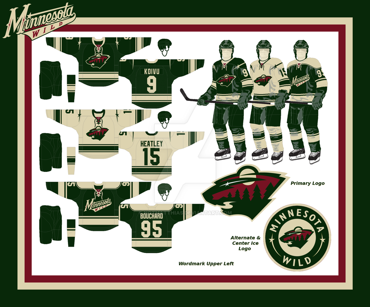
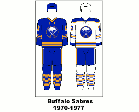
I went with a classic feel for the Wild... They've been leaning that way for a while now (just look at their website), so I took the old-school idea and ran with it.Not unlike their website, I darkened the green and red and pushed the tan (or wheat, whatever) into a more prominent role. In the end, it ended up being mostly green and tan, with red accents.
The striping on the primary was definitely inspired by the current classic-feel alternate, and the stars-over-the-shoulder was inspired by another concept I saw over on the CCSLC forum. (I think it was by Cole, the same guy who inspired me on the 'Yotes.)
I originally was planning on a traditional white away sweater, but I experimented with the tan and loved it. I figure it won't cause problems unless the Wild are playing the Preds in their new sweaters... And that's a "maybe."
As for the alternate, I kept the current one that basically inspired this whole set, but I filled out the "Phantom Yoke" it has.
Y'know, I'm not even gonna bother with the legal crap this time...
Related content


Comments: 10

You don't understand how much I loved the darker green. Good job!
👍: 0 ⏩: 1
")

I realllllllly like this. The darker green just kinda ties everything together, and it works really well. Nice job!
👍: 0 ⏩: 1

Awesome! I think though, that the "Alternate/Center Ice Logo" would look great on the Away jersey.
👍: 0 ⏩: 1

That's true, but one thing I wanted to get away from was the Wild using their a different logo on each jersey...

👍: 0 ⏩: 1
That's what I figured.  (Wink)")
👍: 0 ⏩: 1
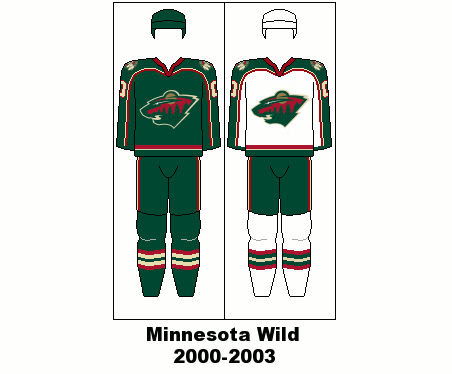
Yeah... They have what may be the greatest set of logos in sports, but how they use them confuses me. Alternate logo on home jersey? Rectangular shoulder patch? So... Simplification was in order.
👍: 0 ⏩: 0

I like it! The green's a little dark for my tastes, but whatever. Love the tan/wheat/whatever jersey as well.
👍: 0 ⏩: 1
I did a lot of experimenting with the green to find what I thought was the right shade... It was an even darker shade of blueish green for a while...
👍: 0 ⏩: 0